ActiveX Grid Control - iGrid
Intro
iGrid is a feature-rich ActiveX grid control. The main idea behind iGrid is to provide the developers with a lightweight and easy-to-use ActiveX grid, which is super-fast, highly adjustable, and ideal for creating unbound grids first of all.
This grid control is a multi-purpose ActiveX component that ideally fits VB/VBA development environments - Visual Basic 6, Microsoft Office VBA and twinBASIC. It can be used in all client and server versions of Microsoft Windows (Windows 95 - Windows 11, Windows NT 4 - Windows Server 2022). Both 32-bit and 64-bit processor architectures are fully supported.
iGrid Customers and Real-World Applications
Usage in real-world apps is the best example of any component. iGrid is used by thousands customers throughout the world, and below is a screenshot of the network inventory system called NEWT developed by Komodo Laboratories using our ActiveX grid:
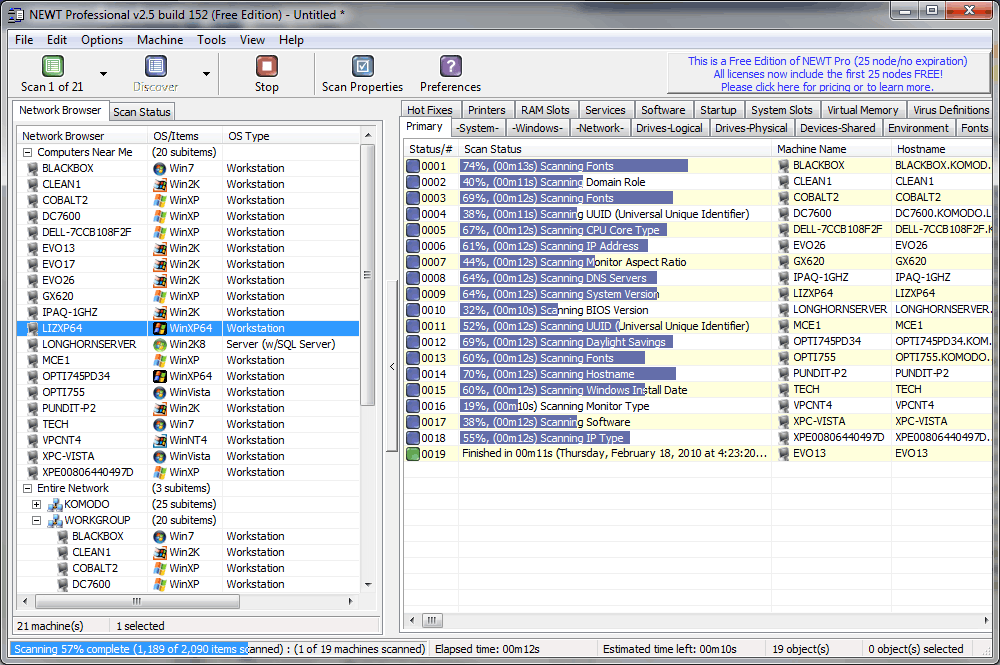
iGrid is the core component of the NEWT visual interface. It is intensively used in many forms to display tons of data about scanned computers. The cells are formatted on the fly and work fast for such big amounts of rows. Some of them contain progress bars to indicate the scan status for each pc; others display cool 32-bit icons with alpha-channel to give the user the best visual representation of retrieved information. In dialogs iGrid is used to adjust the list of columns allowing to do WinAMP-styled reordering of selected items. And all these things are put together by one more iGrid in which the built-in tree view feature is exploited!
Our grid control was rated 5 of 5 by 40 customers. Below is a randomly selected review:
When I was looking for a tool that extends functionality of the standard Microsoft Visual Basic 6 grid controls, I found a reference to iGrid. It looked impressive and its interface was flexible and very easy to implement right out of the box. In no time my application looked and functioned the way I wanted. iGrid has lots of features for various types of applications.
If you need an advanced grid product for your next development project (and for a bargain price), you found it!
Tatyana Pogrebinsky,
Software Engineer,
L-3 Communications,
San Diego, USA
Read all customer reviews of 10Tec ActiveX grid »
Distinctive Features of 10Tec ActiveX Grid Control
- Highly optimized display code enables iGrid to draw large amounts of data without flickering, and much faster than FlexGrid, ListView and other VB grids.
- Access each cell and its individual properties using the cell's row and column numbers, just like a two-dimensional array!
- Each cell can be formatted individually even within the same column using different format strings, fonts, colors, and other flags (horizontal/vertical alignment, an ellipsis at the end or middle of the truncated cell text, etc).
- iGrid provides instant access to any cell by allowing rows and columns to be named, also known as keys. Any cell can then be referenced by their row and column keys, even when reordered.
- Sorting is multi-column with numerated sort icons using different sort criteria for each column (by raw cell data, as case-insensitive text, by icons, by colors, by fonts, etc - including custom sorting).
- iGrid can emulate the Outlook messages list with message preview and supports virtual mode.
- The rich event model helps you to control practically each aspect of the grid, including fine tuning of the editing process (key and mouse processing, data validation, etc).
- Special scroll bar features allow you to display them always even if they are not needed or always hide them. An extended set of scroll bar events gives you control over every user action with the scroll bars.
- iGrid fully supports the native OS look and feel including visual styles available from Windows XP all the way up to the modern versions of the OS including Windows 10 and 11.
Deeper look at the distinctive features »
VB DataGrid, ListView and MSFlexGrid replacement
iGrid is one of the most versatile replacements for the Visual Basic ListView, VB6 DataGrid Control and FlexGrid (MSFlexGrid/MSHFlexGrid) controls which are no longer supported by Microsoft. Moreover, in this case 10Tec ActiveX grid provides you with the built-in cell editing functionality - what isn't possible in FlexGrid and ListView.
Constant support
We are proud to say that despite the widespread occurrence of the .NET Framework, we are still continuing the development of iGrid ActiveX. As a part of the everyday support process, we are preparing samples based on the email requests of our customers, and the best of them are published in the online library of code samples for iGrid. The comprehensive What's New document supplied with the product also proves that we are doing our best trying to provide the developers with the best ActiveX grid control on the market today!