WinForms Grid Control - iGrid.NET
Intro to 10Tec grid for WinForms
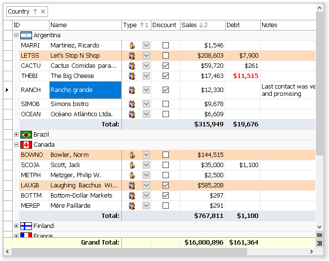
iGrid.NET is a versatile WinForms grid control for the Windows Forms platform, which is a part of Microsoft .NET Framework and .NET Core. Software developers use iGrid for WinForms to build highly adjustable tabular interfaces. It is fast, feature-rich and the ideal unbound grid component for WinForms .NET:
iGrid.NET is a WinForms software component based on the successful ideology of iGrid ActiveX grid control. 10Tec WinForms grid was rewritten from scratch to be a native component on the .NET platform and adds the following features to its ActiveX predecessor:
- print/print-preview and autofilter functionality;
- interactive group box above the column headers area;
- new formatting options for cells - vertical text direction, different text trimming options, and so on;
- several column header rows with the ability to merge column headers vertically and/or horizontally;
- frozen (non-scrollable) rows and columns with customizable edges;
- footer section at the bottom with custom cells or customizable totals;
- full support for right-to-left mode with one
RightToLeftproperty; - highly adjustable scroll bars - you can make them always visible or hidden, they can be semi-transparent or even have additional custom buttons!
One more feature that makes iGrid.NET a rather unique WinForms grid is hierarchical row relations. This functionality is used to create tree grids or highly adjustable TreeView-like controls. We ourselves make extensive use of this feature to build rich-formatted filterable topic lists in 10Tec Help Viewer.
Applications with 10Tec WinForms grid component are developed mainly in Microsoft Visual Studio, but the grid can be used in other development environments allowing you to create applications for the .NET Windows Forms package. iGrid.NET works well in all 32-bit and 64-bit versions of Windows. All client and server editions (Windows XP, Windows Vista, Windows 7/8/8.1/10/11; Windows Server 2003-2025) are supported.
Customer Reviews of iGrid.NET
Many customers of 10Tec Windows Forms grid control appreciate it, and some of them grant permission to publish their reviews on this website. All these 22 developers rated iGrid 5 of 5 stars, and one of these reviews is the following:
iGrid.net is excellent, fully customizable right down to the bone. It's incredibly fast when filling with data whether it be from a dataset or manually filled source.
Not many grids have the capability that iGrid offers!
Top class component, I would recommend to anyone looking for a customizable grid to look at iGrid.
Gary Noble,
Telecom Direct
All customer reviews of 10Tec WinForms grid »
Cell matrix and cell styles in iGrid WinForms grid control
It is very easy to set cell values and format cells of iGrid.NET because they are organized as an array in which you can change every item independently. An alternative and powerful way to format cells is the iGrid cell style object. You can apply a cell style to independent cells or format the entire column with it. If you use a cell style object, you can reformat all the cells linked to the style simply by changing the properties of the style object. This greatly enhances the performance of code and simplifies development!
The vast majority of settings can be done at design time. You can populate and format iGrid in Visual Studio IDE before you compile and launch your project. Cell styles can be used at design time as well.
More about cell matrix in iGrid.NET »
ListView/DataGridView replacement and MS FlexGrid .NET equivalent
Many developers use the standard WinForms ListView control in report mode as a read-only grid in their applications. Our WinForms grid can be used as a powerful editable replacement for ListView. If you go this way, you will also get enhanced cell formatting options and other features you never find in the standard ListView.
If you use the .NET DataGrid/DataGridView control to display tabular data, especially in unbound mode, you can also consider 10Tec WinForms grid as an advanced alternative to DataGrid or DataGridView. These controls have some performance and drawing problems, and they lack for many important features like built-in multi-column sorting and grouping. iGrid.NET looks and works similar to those controls, but it will provide your users with enhanced functionality.
If you are upgrading your code from the classic Visual Basic to VB.NET or C#, and you need a .NET control similar to Microsoft FlexGrid (MSFlexGrid or MSHFlexGrid) that comes with VB, 10Tec grid for WinForms is at your disposal. There are some serious issues with using MSFlexGrid OCX in Windows Forms (it is an old ActiveX/COM technology, FlexGrid does not work in native 64-bit applications, etc). iGrid.NET is a native grid control written specially for .NET, and it can be used as a .NET equivalent for FlexGrid as many coding techniques you can use in MSFlexGrid can be coded using the iGrid.NET members.
Extra samples and constant support
You can download the demo of the grid control that includes many samples with full source code available both in C# and VB.NET, but you can also get other additional samples online from the Extra Sample Library.
We are constantly adding new samples to this page as our customers request typical functionality they can implement in our grid. As a rule, those samples are published in the form of ready-to-use classes you can easily add to your real-world projects. We recommend that you check this page from time to time to get new excellent solutions based on 10Tec grid for WinForms.